
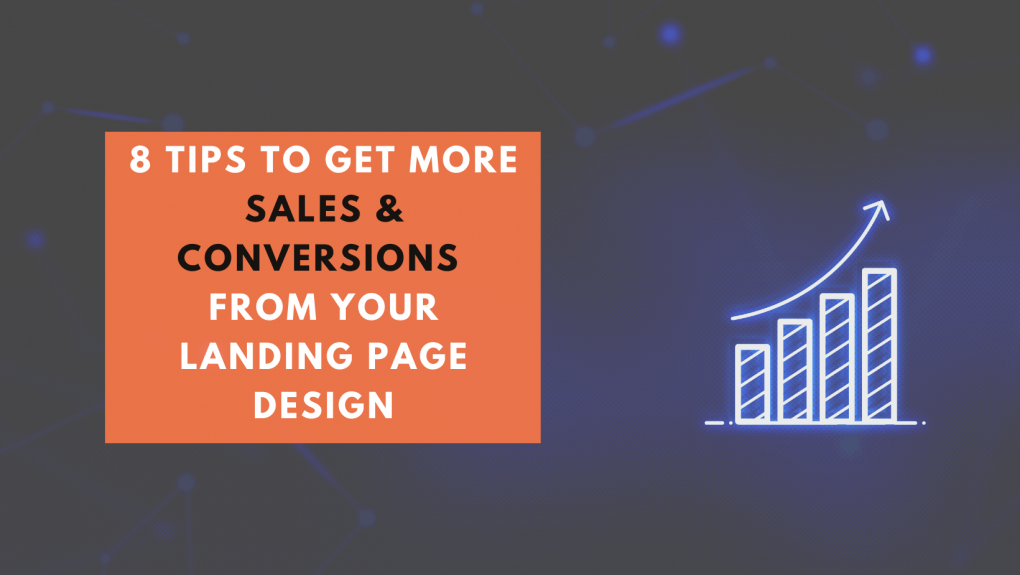
A landing webpage is a page on your website that you direct traffic to.
The purpose of a landing page is to convert visitors into customers by persuading them to take the desired action.
For the online marketers & advertisers, a landing page is a single web page where the users are directed when they click on a link in an advertisement (such as an ad in Google, on Facebook, or on a blog).
#1 Be clear about the offer
Whether you want to get more sign-ups for your email list or more sales, you should be very clear about the offer on the landing webpage design.
Don’t try to be too clever about your landing page because people will just get confused and leave without doing what you want them to do.
#2 Use contrast
One of the best ways to grab the attention of someone on your landing webpage is by using a contrasting color, which is a color that is opposite to the color scheme of the rest of your site.
For example, if you’re using a lot of blue on your site, orange would make for great contrasting color.
Contrast colors stand out to users and help them read the text more easily.
Studies have shown that increases conversions by as much as 20%.
In other words, contrast is important for conversions because it helps direct the eyes and draw attention to certain elements.
Therefore, before you hire a web designer in Singapore to create a landing page for you, make sure to request him to create a webpage with an appropriate contrast.
#3 Focus on urgency
Urgency can help you improve your conversion rate by reminding people that they have a limited amount of time to take action.
Put a countdown timer on your landing webpage to show them how much time is left before the offer expires.
To sum up, urgency is about telling people that they need to do something right now.
#4 Clear CTAs
Urgency can help you improve your conversion rate by reminding people that they have a limited amount of time to take action.
Put a countdown timer on your landing webpage to show them how much time is left before the offer expires.
To sum up, urgency is about telling people that they need to do something right now.
#5 Utilize above-the-fold area
Above the fold of a webpage is basically the area of the screen that can be seen without having to scroll.
The above the fold area of the webpage is what you should focus on when designing a landing webpage. When people land on a webpage, they want to see all of the important information related to the page as soon as possible.
You want your landing page design to have CTA pop out to people and entice them to click on it.
Additionally, you don’t want to have your CTA be too far from the top of the page and you don’t want it to be too subtle.
#6 Responsive design
What’s the responsive design?
Responsive web design is a development approach that uses Cascading Style Sheets (CSS) and fluid grid frameworks in order to create web pages that provide an optimal viewing experience—easy reading and navigation with a minimum of resizing, panning, and scrolling—across a wide range of devices (from desktop computer monitors to mobile phones).
A responsive landing webpage is one that adapts to fit the screen size of the device, which makes it easier for users to navigate & reduces the chances of them abandoning your page.
Hire a Singapore web developer to create a responsive landing page for you!
#7 Eliminate menu navigation
The sole purpose of a landing page is to get the visitor to take a single action. The visitor must be able to take this single action without having to navigate away from the page.
Navigation on a landing page is considered a distraction because it takes the visitor away from the original call to action.
Many visitors don’t come to your website with a specific intention in mind. They usually just want to learn more about you or your products and services.
So, it’s important not to distract them with navigation menus or other links that will lead them away from your landing page.
If you have a landing webpage that looks like a website, then it’s actually less likely that people will convert. The reason is that there’s a lot of distractions.
People are distracted by menus, sidebars, by navigation.
#8 Quick loading speed
The key to a successful landing page is to keep things simple, and speed is a big part of that.
People are much less inclined to convert if they feel like they are being forced to wait, and studies have shown that the majority of people will leave a website if it takes more than three seconds to load.
The load time of a landing page should be no longer than 5 seconds.
The average bounce rate for a landing webpage that takes more than 10 seconds to load is 72%, whereas it’s only 59% if the landing page loads in 5 seconds or less.
Why loading speed is so important for a landing webpage design?
- A quick loading webpage will keep visitors stay on your site.
- A quick loading webpage will help to build trust in your site.
- A quick loading webpage will make your customer have a good experience.
- A quick loading webpage will increase your conversion rate.
Recommended post: 7 Actions to improve the loading speed of your WordPress website