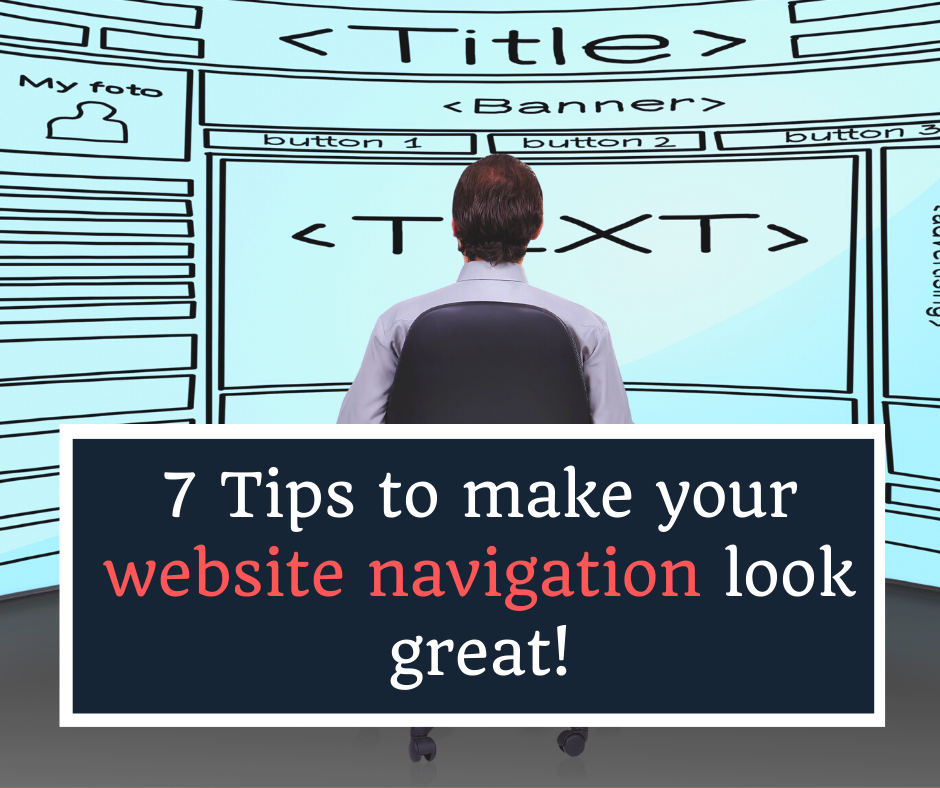
As I’ve mentioned in one of my previous blogs that having intuitive & user-friendly navigation is a pre-requisite of any successful website design.
Intuitive navigation enhances not only the user experience of the website but also boosts the search engine optimization of that website.
Now that we know the importance of having user-friendly navigation, it’s imperative to have one on your website.
But you may ask “How can I make my website’s navigation look great?“.
Or “How can I ensure that my website developer has built an intuitive navigation for my site?“.
In this blog, I have shared 7 tips that can help you or your website developer to make your website navigation look great.
#1 Keep it limited
Keeping the number of menus or links in your navigation limited is perhaps the most important thing that you can do to make your website’s navigation user-friendly.
The simpler the better.
Too many links or menus will do no good to your users except to confuse them.
Try to have a maximum of 5-6 links as your primary menu.
If you have more pages or sections to link up with your menu, you may use them as sub-menus.
Give these important instructions to your website developer so that he can take care of your navigation system while creating the website.
#2 Space to breath
Have you ever seen a website that has too many links in the top navigation and that too is placed too close? I am sure you did.
This kind of cluttered navigation forces the website users to quit the website immediately.
Therefore, your menu items must have some breathing space between them.
Ideally, your website designer must ensure that there are adequate padding and margins around the menu items of your navigation.
The idea here is to create clutter-free navigation for your website design.
#3 Menu levels
An ideal website design shouldn’t have too many levels of menus.
You may like to restrict it up to 3 only (main menus, sub-menus and sub-sub-menus).
The logic is clear; the more levels you will have for your navigation menu, the more it would be difficult for your users to play with the drop-downs.
The pointer of their cursor may lose focus until they reach the last level which feels pretty irritating, at least to me as a user.
#4 Logo conventions
While playing around with the website design can be called ‘creativity’ for most web designers, there are few things that must be left untouched & conventional.
The logo is such an example.
I have noticed on many websites that the designers, for the sake of creativity, placed the logo at the footer instead of the header.
This kind of creativity may seem great in terms of creativity but it can hurt the user experience of the website.
Most internet users tend to follow the conventional system while browsing a website. Anything out-of-the-box may seem unusual to them and they may easily get confused or sometimes overwhelmed.
As a rule of thumb, your website design must have the logo placed on the header along with the navigation and it should be linked to the homepage of your website.
#5 Visuals
Have you ever noticed on some websites, especially e-commerce stores the dropdown navigation that has some visuals or pictures related to the concerned section or category?
This kind of visual placement is good for your website design because it not only looks great but it also lets the users know what they will see inside that section or webpage.
In other words, showing visuals or images in the dropdown menu of your navigation can help you to reduce the bounce rate of your website.
#6 Placement
As a part of a conventional browsing pattern, the menu navigation of your website should be placed on the top.
Again, some web designers may try to think out-of-the-box and move the navigation to the footer, or sometimes they would also use the burger menu on the top right of the page.
The problem with the burger menu is that the users don’t see all the menus of your website until they click the burger menu icon.
According to my experience, this kind of experiment can hurt the user experience.
Not all internet users are aware of the burger menu. This means that you need to show them the navigation clearly on your website design.
#7 Responsiveness
Did you know that more than 60% of the traffic on any website comes from mobiles? In other words, most internet users prefer to browse websites using their smart devices.
Given this scenario, it becomes very important for your web designer to take care of the responsiveness of your website, including your navigation.
Yes, the navigation of your website must be intuitive and easily accessible on all kinds of mobile devices.